Cashyst
Cashyst is a private investigation firm that helps individuals recover unclaimed money across the U.S. The goal was to create a visual identity that felt trustworthy, but approachable and modern.
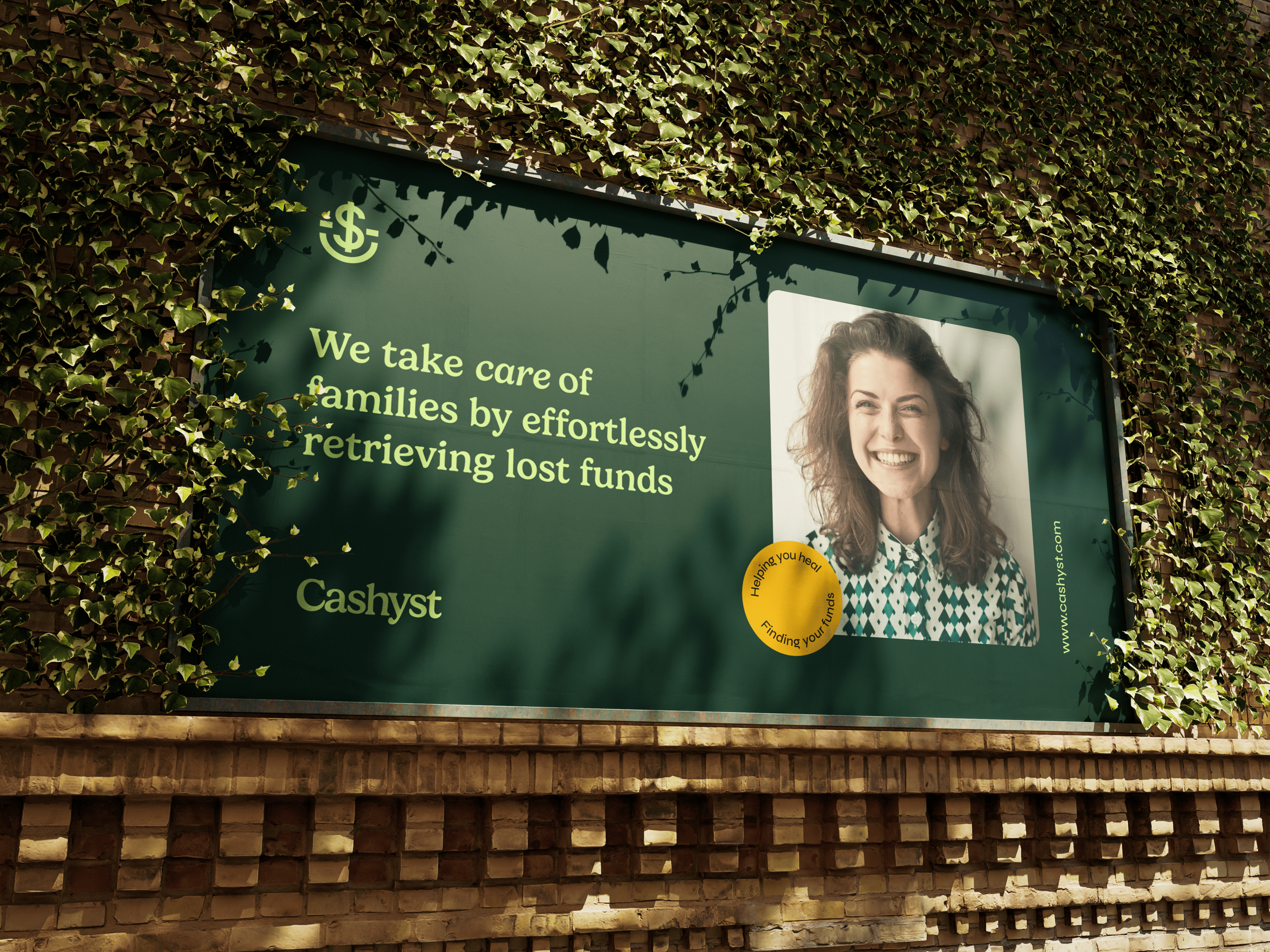
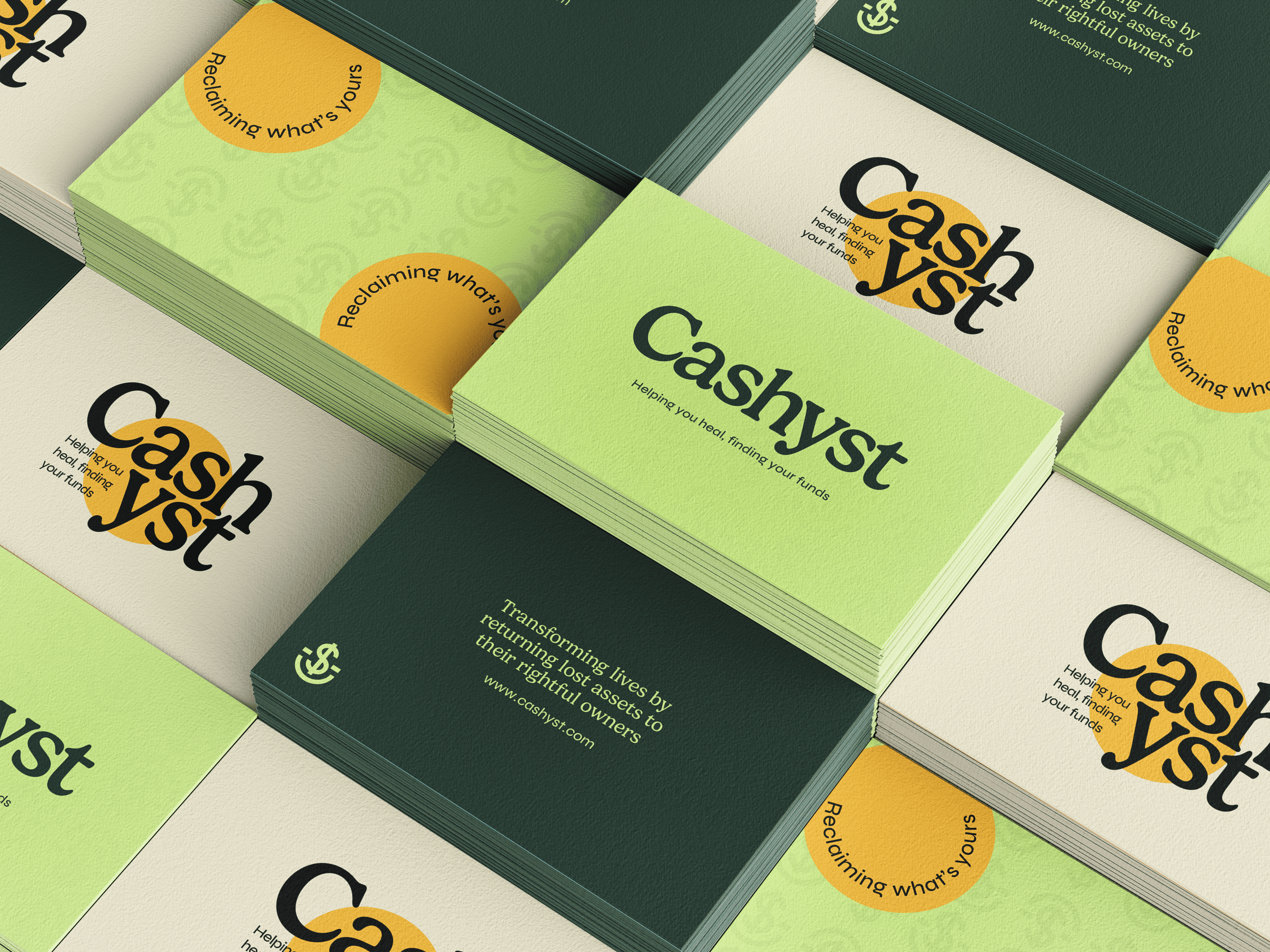
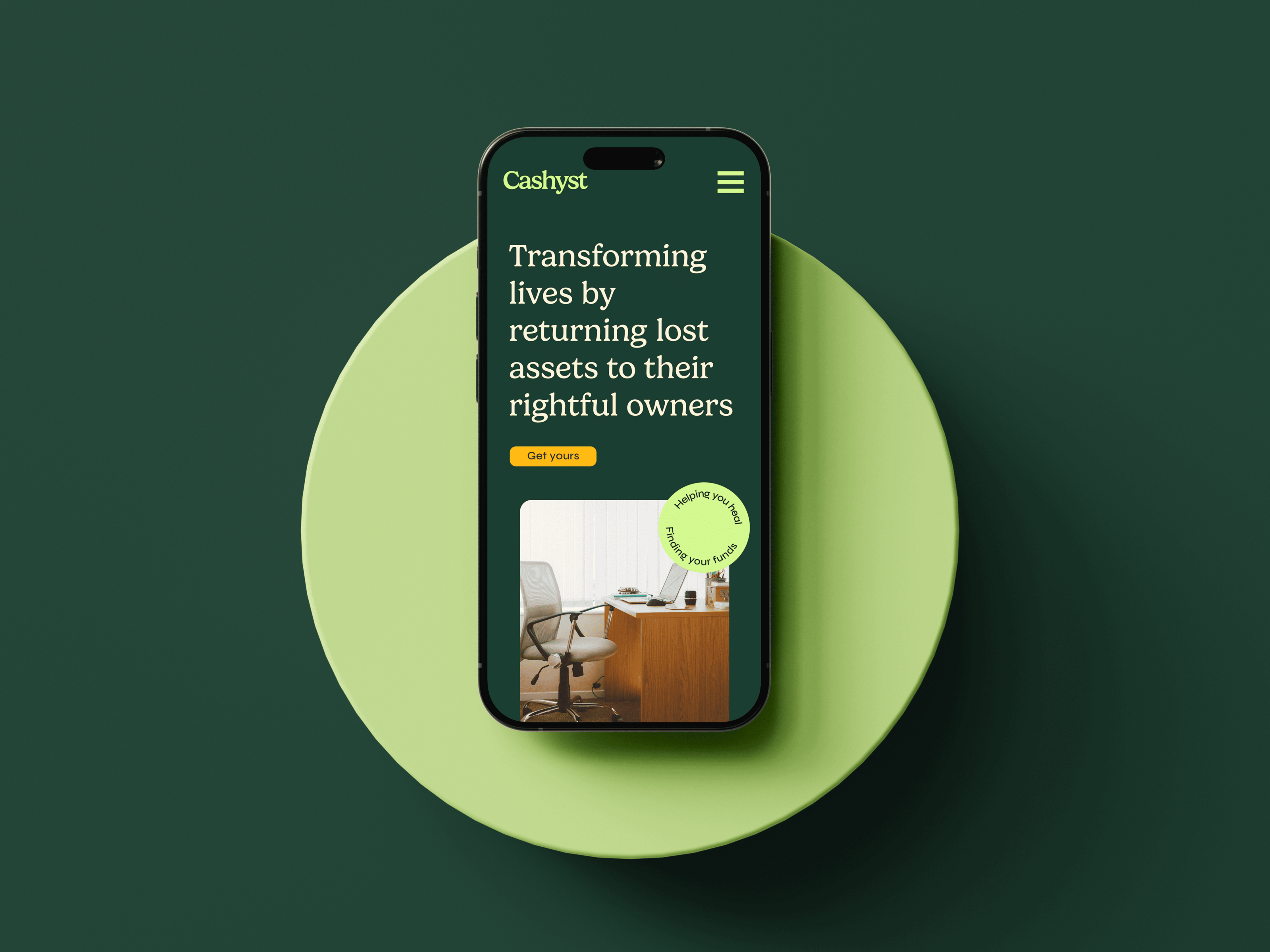
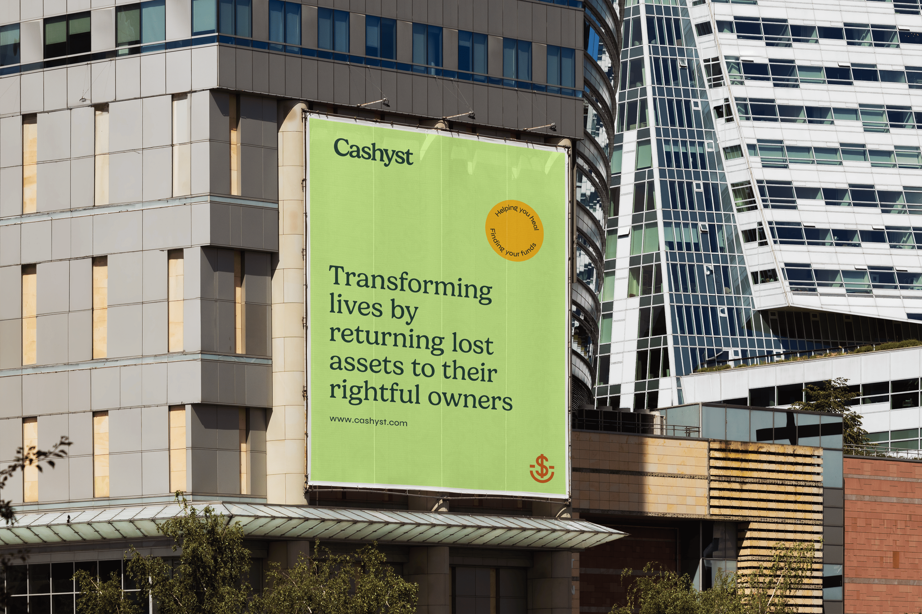
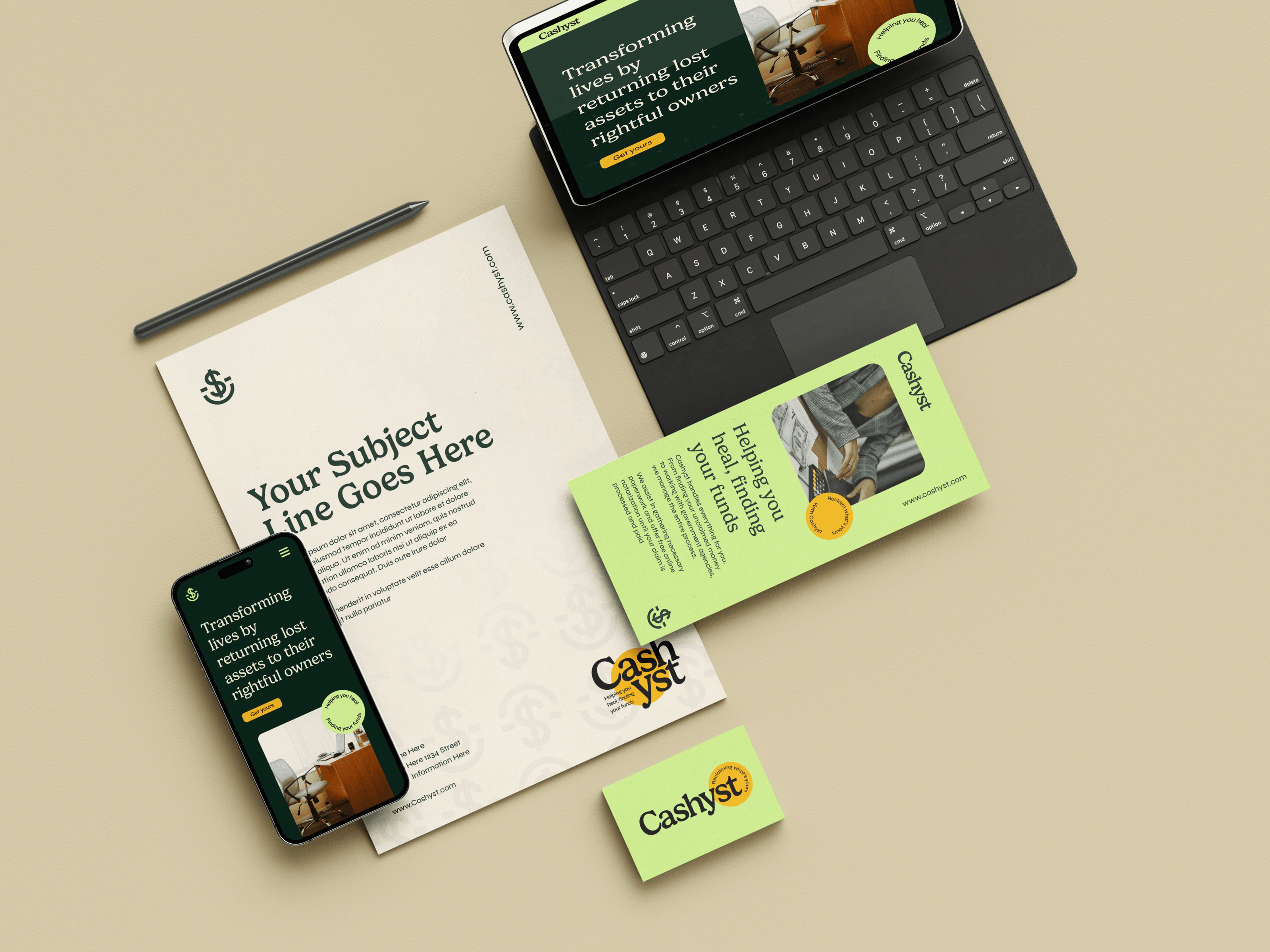


We paired a nostalgic serif with a friendly modern font and used the tagline “Helping you heal, finding your funds” to reinforce the brand’s role as a reassuring presence in a tough time.
To avoid the sterile look of most financial brands, we leaned into soft curves, gentle serif edges & colours that balance fresh with confidence.
The brandmark combines a smile, a dollar sign, and an anchor to represent positive outcomes, financial recovery, and stability.
the brain behind the brand identity


Cashyst’s visual identity was celebrated at the ODA Online Design Awards in two categories.
Gold in Brand Identity
Gold in Brand Collateral.
Cashyst was built on clarity, care, and trust. Seeing that quiet, thoughtful approach get recognised felt like a win not just for the design, but for what it stood for.
Award winning identity design


CASHYST
"Robin and her brain are amazing! She took the information given and created a brand that really converts and sticks in the eyes of customers."
